
Data visualization is displaying and representing data components through methods like graphics, charts, plot diagrams, infographics, and sometimes aminations. This visual and pictorial representation of data acts as a bridge in telling complex data sets and its relationships and data insights in such a way that can be easy to grasp and understand.
Data Visualization Tools are in itself is a very dynamic tool that can be used for varied purposes that sometimes can be no data-driven tasks used in non-data-dominated fields. Furthermore, various companies and organizations also use data visualization techniques to convey ideas and analyses so that can be used to study organizational structures, hierarchical patterns, and the latest trends.
While Data Visualization Tools, as discussed above, can be used in numerous tasks, broadly, there are four major types of functions that a data visualization technique archives: the generation of ideas, illustration of them into various forms, and discovery of new sets of data and everyday data structures. Thus, as we progress into this article, we will discuss each type in detail.
As discussed earlier, various techniques can be used in various fields; however, four techniques are mainly used in Data Visualization Tools.
Data Illustration techniques in the Data Visualization Tools process majorly help in addressing various ideas and concepts that can be a strategy, process or method. The most common use of data visualization techniques is to learn various settings that can be in the form of tutorials, courses where certifications are offered, and various other educational courses. however, these can also be used to represent data of any organization where it involves itself with the organization’s structure, hierarchy and communication that not only facilitates communication between different individuals but also involves many project managers to make of its use efficiently.
Different individuals working in organizational settings make use of data-driven charts that can be Gantt charts or waterfall-type charts in order to exhibit different types of workflows. Furthermore, it also uses data modeling to represent various data-driven structures and build various information systems. This not only makes it easier for developers and data architects to understand various relationships in data but also doesn’t need many tutorials to guide them through the data.
Data visualization tools are also used at various times when there is a specific need to generate new ideas and concepts. They are majorly used in organizational settings to create and brainstorm ideas through various pictorial diagrams. For instance, various companies, during the beginning of a project opt to include design thinking meetings that serve as a foundation to develop new ideas and solutions through the use of data visualization techniques.
Since Idea generation techniques are usually in the initial stages of any project or process, they tend to be mostly unrefined and unstructured. However, they still help organizations to align their teams and streamline communication through various techniques.
Visual discovery is another type of technique where data visualization tools help a lot. Visual discovery mostly helps data scientists and analysts to establish and identify various patterns that could be present within the data structure sets and also help in creating the latest trends by carefully studying the data. Data viz helps in everyday tasks and contains rudimentary techniques that are not complex and can be easily done and undertaken in day-to-day tasks.
Frankly speaking, there are tons and hundreds of data visualization tools that are available in the market, that are used to create various visualization sets. However, not all of these tools are as effective at the type of task to be carried out, and thus it is important to know which type of tools suit your data visualization requirement.
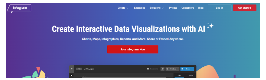
Infogram is a data visualization tool that focuses mainly on drag-and-drop techniques to create various data sets. Its easy user interface allows even individuals not well-versed in the tools to create and use them for their tasks. This tool benefits individuals who want to create social media campaigns and posts depicted with graphical and pictorial representation.
The output process in this tool is also easy as it can easily export the files in various formats ranging from PNG, JPG, GIF, HTML, and PDF. Furthermore, individuals can also create output with animations that can easily be embedded in various websites.
Overall, this tool can be used for most data-driven tasks. Furthermore, its lower pricing also makes it more lucrative. However, since it offers few data sources by default, this may pose problems for some individuals who want a wide range of data sources.
Data visualization is one of the most important steps in the data analytics process, which not only helps create an effective set of data but is also used to identify the latest trends. With a huge variety of data visualization tools offered in the market, it can sometimes be hard to decide which data tool to use. However, it is essential to remember that going on to use the most powerful tool can be appealing in the beginning. However, this may also be difficult to learn. So, it is essential to choose a tool that fits your capabilities and requirements and upgrade it gradually.
Be10x has trained thousands of professionals to boost their careers with AI, as well as students who want to pursue a career in AI and ML
You can join our workshop for just Rs 9, and you will also get bonuses worth Rs 10500. You will be trained by Industry Experts Aditya Goenka and Aditya Kachave. Join the workshop today to gain extra benefits.
Teams Zsystems AI
Embark on a career transformation with GenAI Ninja! Dive into the dynamic realm of Generative AI, a groundbreaking technology reshaping our century.
Embark on a career transformation with GenAI Ninja! Dive into the dynamic realm of Generative AI, a groundbreaking technology reshaping our century.